Why Some Custom Event Logos Get Used Daily While Others Get Tossed
The Walking Billboard Dilemma: Why Date-Heavy Logos Expire Fast
The real difference between a piece of event merchandise someone cherishes and something left behind in a hotel trash can comes down to a single question: Does this item serve the person who received it, or does it only serve the company handing it out? When promotional gear is treated as a mobile billboard, people instinctively push back. Nobody wants to walk into a weekend gym session or a casual dinner with friends wearing a giant corporate graphic across their chest. If an item feels like forced advertising, its destination is almost always the landfill.
Longevity begins with separating the core brand identity from the specific calendar weekend. When deciding what text and dates to include or leave out, the safest sourcing decision is to keep dates entirely off physical goods. Adding "Annual Expo 2026, Chicago, IL" directly under your logo instantly timestamps the product. The moment closing remarks end, that gear feels like yesterday's news. Leaving out specific years and host cities keeps the merchandise visually relevant for years, turning a short-term event expense into a long-term brand asset that can even be integrated into future teaser campaigns or recurring staff rotations.
The Logo Hierarchy: Primary Marks, Submarks, and Modular Patterns
One common hurdle during merchandise procurement happens right when the design files arrive. Sourcing teams often open an artwork folder and wonder why there are so many distinct assets instead of a single image. Relying on a single horizontal logo file is one of the fastest ways to compromise product quality. Physical merchandise comes in dozens of geometries, from wide tote bag panels to narrow tumbler walls and tiny wristbands. A mark that looks balanced on a wide desktop banner will look cramped and illegible when squeezed onto a baseball cap or a water bottle base.
High-retention merchandising relies on a full suite of logo variations:
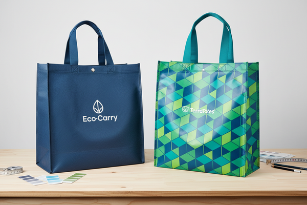
- Primary Logo: The foundational horizontal lockup featuring the full brand name and icon. This format works cleanly on broad surfaces like presentation folders, packaging boxes, and wide carry-all totes.
- Secondary or Stacked Logo: A vertical or circular realignment of the primary elements. This option steps in when the horizontal mark would appear too small to read within narrow, portrait-oriented print areas.
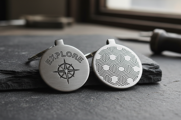
- Submark: A stripped-down, compact mark—often just a single standalone icon, monogram, or geometric fingerprint pulled from the main logo. Submarks are purpose-built for tight placements like social media avatars, drinkware bases, and apparel cuffs.
- Favicon or Icon Mark: The most distilled visual element, engineered to stay sharp even down at 16x16 pixels.
- Custom Pattern: A repeating motif derived from the core logo geometry, ideal for subtle textile weaves, interior garment linings, and custom accessory straps.
Subtle Placement and Scale: Cuffs, Hems, and Quiet Branding
Once you have a versatile mark, where you put it matters just as much as what it looks like. Traditional corporate giveaways default to the dead center of the garment or the widest face of a product. In contrast, retail apparel brands almost never put a massive high-contrast logo across the center chest unless that graphic is an original piece of lifestyle artwork. Shifting the decoration to retail-inspired locations changes how the recipient perceives the entire item.
If you want people to wear a pullover or active set outside the venue, move the branding to subtle touchpoints. A small submark embroidered on the lower left hem, a tonal logo placed on the wrist cuff, or a tiny woven label stitched into a side seam communicates quality and restraint. On hard goods like double-wall stainless steel tumblers, placing a laser-engraved icon near the bottom rim allows the sleek finish of the product to lead. Subtle branding increases total lifetime impressions because the item gets worn repeatedly in social, professional, and athletic settings where loud corporate logos are unwelcome.
Substrate Matters: Matching Decoration to Daily-Use Goods
Choosing a versatile design style is only half the battle; the design must also match the physics of the physical substrate. Sourcing teams must consider how artwork interacts with different production methods. High-contrast, bright corporate colors printed on synthetic fabrics often yield a stiff, rubbery surface feel that cracks over time. Moving toward tonal or monochromatic color palettes creates an elevated, tactile experience that integrates naturally into the item's texture.
For activewear and technical knits, tonal silicone heat transfers or direct flat embroidery provide durable flexibility without bunching the fabric. On hard goods, laser engraving removes the outer powder coat to reveal the raw metal underneath, providing a permanent finish that never peels or fades through dishwasher cycles. When selecting the best merchandise for your logo, prioritize durable everyday essentials like vacuum-insulated drinkware, comfortable active sets, and structured canvas bags. If the underlying product lacks genuine utility, no level of design sophistication will save it from being discarded.
Community Identity over Corporate Advertising
Attendees keep and wear merchandise when it represents a community they are proud to belong to. A memorable conference or brand launch creates shared energy and positive associations. When the event logo is clean, modern, and uncluttered, wearing it feels like carrying a badge of honor rather than displaying a corporate sponsor's business card.
This emotional connection thrives when the design focuses on the "why" rather than the "when." Centering the visual identity on a shared mission, aesthetic movement, or industry milestone gives the product lasting cultural value. When an attendee reaches into their closet on a Saturday morning, they choose apparel that aligns with their personal style. A well-designed, understated event mark allows them to celebrate their connection to the community without compromising their personal aesthetic.
Sample Auditing: Testing Scalability and Micro-Detail Resolution
Before issuing final production approvals for bulk event orders, rigorous physical sampling is essential. Sourcing teams must audit how the artwork scales across different substrates and inspect physical samples under realistic lighting conditions.
Follow these practical checkpoints during the pre-production sample review:
- Monochrome Legibility: Confirm that the mark retains its clarity and impact when stripped of all color gradients and rendered purely in black, white, or single-color laser etching.
- Small-Scale Resolution: Measure fine lines and negative spaces in small embroidery hits to ensure threads do not bleed together into an unrecognizable blob.
- Edge Adhesion and Softness: For heat transfers on apparel, check that all fine corners are securely bonded and that the transfer remains supple when the garment stretches.
- Contrast and Tonal Balance: For tone-on-tone decorations, verify that the logo remains visible from an arm's length without clashing against the base material color.