

What Makes a Custom Product Look Premium? The Science of Subconscious Luxury in Batch Manufacturing
Step away from the screen for a second and think about the last time you opened a package that made you pause. You didn't just rip through the tape; you slowed down. You felt the unusual texture of the container, noticed how cleanly the lid slid away, and admired the absolute minimalism of the branding. Long before you even interacted with the product inside, your brain had already made a definitive judgment: This is high luxury.
In modern e-commerce networks and community brand-builder circles, this reaction is the ultimate prize. Founders frequently study viral feeds where creators showcase their latest hauls, looking for the secret formula that transforms standard merchandise into a premium lifestyle statement. When scaling an independent store, simply placing a standard design onto a generic blank no longer moves the needle. If your custom execution feels like an afterthought, consumers instinctively categorize it as a low-tier dropshipping project, regardless of how much you charge at checkout.


True luxury perception isn't achieved by merely inflating your retail price or splashing gold gradients across every visible surface. Instead, premium status is a systematic psychological journey built through intentional design restraint, tactile material engineering, and structural storytelling. When configuring your production runs through comprehensive manufacturing hubs like SupplyBatch Categories, understanding these subtle visual and sensory principles allows you to design items that instantly command trust, authority, and premium pricing margins.
Luxury is not the addition of noise; it is the absolute elimination of flaws and the masterful execution of structural restraint. When a product feels premium, it speaks through silence rather than shouting for attention.
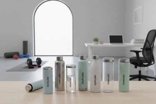
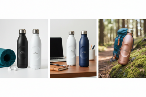
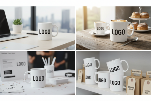

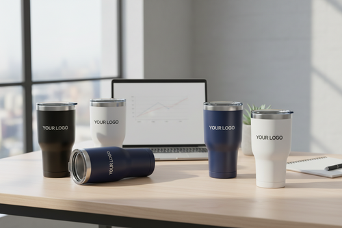


1. The Visual Paradox: Embracing the Power of Design Restraint
When emerging brands dip their toes into the world of custom merchandise, their first impulse is often to maximize their canvas. They make the company logo as large as possible, use vibrant full-bleed color print runs, and cram every empty corner with brand taglines, social handles, and blocky icons. In luxury design ecosystems, this approach achieves the exact opposite of its intended goal—it screams for attention, signaling a lack of brand confidence.
The Sophistication of Scale and Negative Space
If you study the most celebrated high-end custom creations circulating in online design spaces, you will observe a common theme: extreme restraint. Premium aesthetics rely heavily on generous negative space—the intentional emptiness surrounding your design elements. By allowing your layout to breathe, you signal that the product itself is important enough to stand alone without relying on decorative camouflage.
Consider downsizing your logo by thirty to fifty percent on your next production run. Moving a branding asset away from the absolute center and tucking it neatly into an unexpected, subtle position—such as the lower third of a custom box or the inner seam of an apparel item—creates an intimate, insider discovery experience for the buyer. This micro-branding approach changes the item from an explicit commercial advertisement into a refined personal accessory.
Typography Selection and Layout Balance
Your choice of lettering tells a profound story before a customer ever reads the actual words. High-end custom products almost universally reject complex, overly decorative fonts in favor of ultra-clean geometric sans-serifs or classic, high-contrast editorial serifs with wide letter-spacing (tracking). Increased spacing between characters gives text an airy, elegant, and intentional rhythm that feels curated by an artisan rather than generated by a generic template machine.
When designing tags, labels, or containers, keep font variations to an absolute minimum. A single font family utilized across different weights (such as pairing a light subhead with a bold minimalist title) establishes a cohesive layout that feels unified and effortless. To explore how professional typography scales across curated accessories, review the design templates available in our dedicated Custom Packaging Solutions hub.
2. The Physics of Luxury: Material Selections and Haptic Feedback
Human beings are intensely sensory creatures. While our eyes are easily deceived by digital filters and polished product renderings on a screen, our hands possess an immediate, uncompromised honesty. The moment a customer lifts an item out of its shipping container, their fingertips run an instantaneous quality audit. If the material feels flimsy, light, or rough, the premium illusion shatters instantly.
The Psychological Impact of Weight and Density
There is a direct, hardwired link in the human brain between physical weight and perceived financial value. In community product forums, developers frequently discuss making a product feel more premium simply by altering its material density. A custom box made from ultra-thick paperboard or a custom container manufactured with an internal structural core feels solid, substantial, and anchored in the physical world.
When manufacturing paper-based goods, hangtags, or structural packaging, always aim for high-density configurations. Standard retail boxes typically use light, flexible cardstock, but luxury brands elevate their batches by choosing thick rigid board (often 1200 to 1500 GSM or higher). This structural thickness ensures that corners remain perfectly square, edges do not bend under pressure, and the container emits a solid, satisfying acoustic "thud" when set down on a table.
Finishes that Redefine the Surface
High-gloss plastic coatings reflect ambient room glare, show oily fingerprint smudges immediately, and look highly commercialized. To elevate your custom run, transition toward sophisticated surface treatments that invite prolonged physical contact:
- Soft-Touch Matte Lamination: This velvety surface treatment completely absorbs light, giving your containers a rich appearance while offering a surprising skin-like tactile feel.
- Raw, Uncoated Organic Textures: Embracing the natural, fibrous texture of premium cotton paper or recycled organic pulp introduces a tactile authenticity that resonates beautifully with modern luxury consumers.
- Spot UV Layering: By applying a high-gloss protective lacquer exclusively to a tiny, minimalist element (like a thin line of text or a geometric pattern) on top of an otherwise dead-matte background, you create a captivating contrast that shifts beautifully when held under ambient light.
| Design Attribute | Standard Execution (Mass-Market Look) | Premium Execution (Luxury Batch Look) |
|---|---|---|
| Logo Presentation | Oversized, full-bleed ink printing placed aggressively in the center. | Downsized micro-branding utilizing blind debossing or elegant foil hits. |
| Surface Texture | Standard high-gloss UV coating that catches glare and fingerprints. | Soft-touch matte lamination or raw, fibrous organic cardstock textures. |
| Material Integrity | Lightweight, flexible paperboard (folding cartons) prone to edge warping. | Ultra-dense, rigid setup boards (1200+ GSM) with perfect 90-degree corners. |
| Color Ecosystem | Uncalibrated tones that shift noticeably between paper, plastic, and fabric. | Strict, unified color curation matching every accessory to identical tones. |
| Interior Protection | Loose crinkle paper, messy plastic bubble wrap, or empty air space. | Precision-engineered structural cardboard trays or velvet-lined inserts. |
3. Invisible Details: Dimensional Elements and Foil Engineering
Premium custom execution relies on details that exist in three dimensions. When a design is completely flat, it requires zero specialized manufacturing expertise. However, when a brand introduces structural depth into the surface of their products or labels, it signals to the consumer that an immense amount of engineering care went into the batch production run.
Debossing vs. Ink Printing
Instead of relying purely on colored inks to display your brand name, consider using structural manipulation. Blind debossing presses your design directly down into the material fibers without using any ink at all. This technique relies entirely on light and shadow to reveal the design, creating a classic, elegant mark that feels carved rather than stamped. For apparel accessories, integrating these tactile details onto heavy hangtags immediately elevates the perceived worth of the garment. You can explore these tactile options by visiting our Custom Embossed Hangtags Product Page.
Foil Stamping with Restraint
Metallic foil stamping is a powerful weapon in luxury branding, but it must be wielded with absolute precision. Flood a container with gold or silver accents, and it quickly begins to look gaudy and cheap. Apply it to a single microscopic detail—such as a tiny geometric line along the opening seam or a thin, elegant serif subhead—and it transforms into an exquisite marker of quality. Modern trends favor subtle metallic choices like brushed champagne gold, matte rose copper, or deep charcoal metallic foil, all of which offer a sophisticated shimmer rather than a blinding reflection.
Pro-Tip for Brand Scaling: When designing dimensional elements, always test how your shadows behave. Elements that feature a sharp, crisp bevel capture surrounding room light much more effectively than rounded, muddy impressions.
4. The Harmony of Color: Creating a Flawless Cross-Substrate Ecosystem
One of the most frequent mistakes highlighted in creator community spaces is color fragmentation. A founder selects a beautiful tone of dusty plum or muted forest green for their brand identity. However, when their production batch arrives from separate generic suppliers, a harsh reality sets in: the color on the custom plastic mailer looks completely different from the color on the cardboard storage box, which looks entirely different from the color on the fabric product tags.
The Subconscious Alarm of Mismatched Tones
When a consumer unboxes a package and encounters three different variations of what is supposed to be the same brand color, their brain senses a mistake. It signals that the company lacks complete control over its supply chain, instantly breaking the luxury spell. Premium brands understand that color continuity is a mandatory requirement for building consumer trust.
Achieving absolute uniformity across diverse materials—such as raw kraft paper, dyed satin ribbons, cotton textile labels, and corrugated shipping cardboard—requires a centralized manufacturing partner. By processing your entire branding kit through a single unified production channel like SupplyBatch Custom Fulfillment, you ensure that ink formulas, material substrates, and curing temperatures are calibrated together. This level of oversight guarantees that every piece of your unboxing experience speaks the exact same visual language.
Curated Color Strategies
If you want your custom items to align perfectly with contemporary, high-end Western design aesthetics, lean toward desaturated, sophisticated palettes. Muted earth tones, warm terracottas, sage greens, deep slate greys, and complex tinted neutrals (like off-white, cream, and warm sand) look naturally premium. These colors feel organic, calm, and expensive, seamlessly integrating into a customer's personal living space or curated lifestyle aesthetic without clashing.
5. Structural Unboxing Architecture: Designing the Journey of Reveal
A premium product is never merely discovered all at once; it is slowly revealed over a sequence of intentional steps. The physical journey a buyer takes from the moment the courier drops off the package to the final moment they hold the core item is a powerful marketing engine. This structural narrative is exactly what drives consumers to record their opening experiences and share them enthusiastically within their online circles.
The Suspense of the Perfect Lid Sliding Fit
For high-end electronic accessories, luxury jewelry, or premium cosmetics, the two-piece lid-and-base box is a classic choice for a reason. But a truly premium box goes a step further by perfecting the pneumatic friction of the opening sequence. When a customer lifts the upper lid by its top, the bottom base should slide down slowly, taking roughly two to three seconds to separate under its own weight. This smooth glide creates a momentary pause of anticipation, transforming a mundane task into a memorable performance.
Alternatively, implementing rigid magnetic flip-top closures introduces a crisp, tactile "snap" sound upon closing. This solid mechanical click provides immediate psychological reassurance that the product is protected inside an expertly crafted enclosure. Explore our full range of structural options on the Rigid Gift Boxes Page to find the ideal opening mechanism for your product line.
Internal Placement and Precision Inserts
Nothing kills a premium impression faster than opening an elegant exterior box only to find the item wrapped loosely in plastic bubble wrap, or sliding around aimlessly amidst chaotic crinkle paper. True premium presentation requires absolute order and immaculate internal security inside the container:
- Custom Molded Cardstock Trays: Engineered from a single sheet of die-cut paperboard, these inserts hold your product perfectly flush with the inner surface, maintaining clean geometric lines.
- Velvet or Satin-Lined EVA Foam: Ideal for high-end lifestyle gadgets, delicate glassware, or fine jewelry, dense foam inserts custom-fit to the contours of your product provide maximum shock absorption while presenting the item like a rare museum artifact.
- Custom Tissue Seals: Wrapping internal elements in custom-printed matte tissue paper, neatly held together by a minimalist paper sticker or a subtle wax seal, adds an extra layer of discovery that requires an intentional physical touch to open.
6. Moving Away From the "AI Look": Injecting Human Vitality into Your Batch
We live in an era where automated generation can occasionally make digital storefronts feel cold, repetitive, and sterile. When everything looks perfectly generic, consumers begin to crave human authenticity and small, intentional design touches. To ensure your custom production run doesn't look like a mass-produced item off a generic assembly line, you need to infuse it with artisanal character and real lifestyle resonance.
Authenticity via Micro-Copywriting
Instead of printing standard instructions or generic statements like "Thank you for your purchase," use unexpected spaces to communicate your brand's personality. Placing a warm, casual greeting on the hidden interior flap of a box—visible only when the container is completely unpacked—creates a personal, human moment between your brand and the individual buyer.
Keep your language natural, conversational, and lighthearted. Phrases like, "We're so glad this found its way to you," or "Handcrafted for your daily ritual," feel incredibly human, warm, and authentic. This approach shifts your identity away from a cold, distant corporation and positions you as an intentional creator group.
Asymmetry and Character Variations
Perfect symmetry can sometimes feel mechanical and mass-produced. Introducing subtle, deliberate variations can break up the monotony and add a premium feel. For example, utilizing an off-center geometric accent line across a collection of labels, or integrating a textured ribbon pull-tab on a drawer box, adds a layer of manual craftsmanship. It reassures the customer that a human team sat down, brainstormed the physical layout, and curated the batch with clear intention.
7. Real-World Deep Dives: Sector-by-Sector Premium Upgrades
Different product categories require unique design approaches to project a premium feel. Let's explore how custom manufacturing details can be specifically applied across different retail sectors to maximize value perception.
D2C Fashion Apparel and Streetwear Brands
In the apparel world, the product's premium feel often depends heavily on the execution of its external and internal accessories before the garment is ever worn. Sending an expensive jacket or premium knit sweater inside a flimsy, clear plastic bag with an ordinary sticker instantly cheapens the item.
To upgrade your fashion line, replace thin plastic mailers with thick, custom matte shipping bags or structured cardboard presentation boxes. Inside, ensure your garments feature high-density woven neck labels with ultra-crisp stitching rather than scratchy, cheap heat-press prints. Every item should carry a heavy-weight cardstock hangtag attached via a braided cotton cord or a sleek metal safety pin instead of a standard plastic swift-tach fastener. This creates a tangible layer of premium craftsmanship that customers can feel before trying on the garment.
Bespoke Cosmetics and Skincare Collections
Cosmetics are personal items that sit directly on a user’s vanity, making their aesthetic presentation an integral part of the daily beauty ritual. The custom packaging must look elegant, clean, and beautifully organized.
For skincare batches, transition toward frosted glass bottles or heavy-walled matte containers that feel substantial and cool to the touch. The outer boxes should utilize soft-touch lamination paired with interior structural liners to prevent any rattling during shipping. Incorporating a thin spot UV pattern across the outer box allows the packaging to catch the bathroom mirror lighting beautifully, instantly transforming a simple daily routine into a high-end luxury self-care experience.
Premium Lifestyle Tech Accessories
Consumer tech and smart accessories demand clean, industrial precision. The visual language here should focus on clean lines, flawless fits, and high-performance material protection.
When engineering boxes for smart gadgets, phone cases, or luxury tech tools, focus heavily on structural protection and snug component cutouts. Utilize dense, black EVA foam inserts that keep the product and its accompanying charging cords perfectly managed. The outer sleeve of the packaging should glide off effortlessly with a smooth pneumatic release, signaling precision manufacturing that mirrors the high-end technology housed inside.
8. Production Blueprint: Bringing Premium Customization to Your Supply Chain
Many independent founders believe that executing this level of premium detail requires massive capital investments and seven-figure production volumes. In the past, legacy manufacturing plants only offered luxury finishes like spot UV, custom structural dies, and rigid board boxes to enterprise clients who could commit to tens of thousands of units per run.
Today, modern production platforms have completely rewritten the rules for emerging brands. By utilizing agile, modular sourcing networks, small businesses can access high-end customization techniques at incredibly manageable minimum order quantities (MOQs). This equalization of manufacturing tech means that a boutique startup can ship products that look just as premium as established global luxury houses.
Maximizing Efficiency Without Sacrificing Quality
If you are navigating a tighter initial budget, you can optimize your spending by focusing on key high-impact areas. You don't need to implement every single luxury upgrade simultaneously to elevate your product's presentation. Start by investing in a single, high-leverage sensory touchpoint—such as upgrading your main hangtag to an ultra-thick debossed board, or wrapping your standard items in beautiful custom tissue paper sealed with a minimal foil sticker. These targeted enhancements allow you to maximize your unboxing impact while keeping initial manufacturing costs highly efficient.
Ready to map out your brand's physical upgrade and transform your upcoming production runs into an unforgettable premium experience? If you have questions regarding material tolerances, structural die lines, or custom color matching, browse through our clear SupplyBatch Help Center and FAQ for expert manufacturing support. Let's collaborate to build a beautiful, custom physical asset that commands immediate authority in your market and delights your community with every single delivery.


