Minimalist Branding: Why Less Is More for Corporate Merchandise
1. Minimalist Branding: Why Less Is More
A procurement director at a mid-sized fintech told me recently: "I just want the logo on a hoodie. Why does it always turn into a whole production?" She wasn't asking about manufacturing timelines. She was asking why every merchandise program seems to default to maximum coverage—logo on the chest, logo on the sleeve, tagline on the back, website URL down the arm. It's a fair question. The answer isn't about what's possible. It's about what actually works.
Corporate merchandise has a habit of becoming a canvas for every brand asset a company owns. The result is often a product that communicates urgency rather than confidence—as if the brand is shouting to be noticed. Minimalist branding flips that instinct. It trusts that a well-made product with a thoughtful mark says more than a fully wrapped item that screams "promotional." For procurement managers and brand directors sourcing across multiple categories—apparel, drinkware, tech accessories, stationery—the shift to minimalism changes how you brief suppliers, evaluate samples, and measure success.
2. The Context Behind the Decision
If you've been buying custom merchandise for more than a few years, you've seen the pendulum swing. Five years ago, the brief was "make it visible from across the room." Today, the same brand directors are asking for "tonal embroidery," "edge branding," and "single-color placement." The shift is partly aesthetic—design has moved toward restraint across the board—but it's also practical.
Employees and clients are less likely to use merchandise that feels like a walking advertisement. A hoodie with a small chest logo gets worn to the grocery store, on the weekend, in the office. A hoodie with a full back print, sleeve logo, and URL often stays in the drawer. The same logic applies to drinkware, notebooks, and tech accessories. The product's utility matters more than the logo's size. That means your sourcing strategy needs to prioritise product quality and material feel over branding coverage. A heavy cotton hoodie with a subtle mark has staying power. A lightweight polyester polo with a full-color chest print often becomes a one-time wear.
This also changes how you evaluate suppliers. The best vendor for a full-coverage program might not be the best vendor for a minimalist one. A screen printer who excels at fine detail and color matching will serve you better than one who specialises in high-speed, high-coverage runs on cheap blanks. The substrate matters—cotton, stainless steel, ceramic, and ABS plastic all behave differently under the same decoration method. A logo that looks clean on a flat t-shirt can shift or spread on a curved ceramic mug. A laser engraving that reads perfectly on stainless steel might lack contrast on a dark anodized surface. The point is not that these categories are difficult—they are manageable if you treat each one with the respect it deserves.
3. What Actually Works
The best minimalist-branded merchandise programs share a few characteristics. First, they limit the number of brand elements per product. One mark, one location, one color. A single-color logo or monogram placed cleanly—on the chest of a garment, the base of a water bottle, the cover of a notebook—communicates confidence. It says the brand doesn't need to announce itself repeatedly to be recognised.
Second, they prioritise substrate and finish quality. A minimalist logo on a cheap, thin t-shirt looks like a cost-cutting measure. The same logo on a heavy-weight hoodie or a high-grammage cotton tee reads as intentional. For drinkware, a brushed or matte finish often handles a small logo better than a high-gloss surface, which can reflect light and obscure fine detail. For stationery, debossed or foil-stamped branding on a thick cover stock carries weight that a printed logo on cheap cardstock never will.
Third, they plan for consistency across categories before they ever issue an RFQ. This is where procurement managers often stumble. They know their brand colors, but they don't always know how those colors behave on different substrates. A Pantone reference that looks perfectly matched on paper can shift on cotton, fade on ceramic, or read differently on stainless steel. The solution is straightforward: specify your PMS values, request physical color samples from each vendor on their specific material, and approve one master sample per product category rather than assuming a single standard will hold across every item.
Fourth, they build a lead time matrix that accounts for each category's production rhythm. A cotton tote bag might run in seven days. A custom ceramic mug with a specific Pantone color might need twenty-one. A tech accessory with custom packaging might run longer. If you treat all categories as having the same lead time, you will delay your whole program waiting on the slowest item. Map it out by category before you set your launch date.
4. The Part Most People Skip
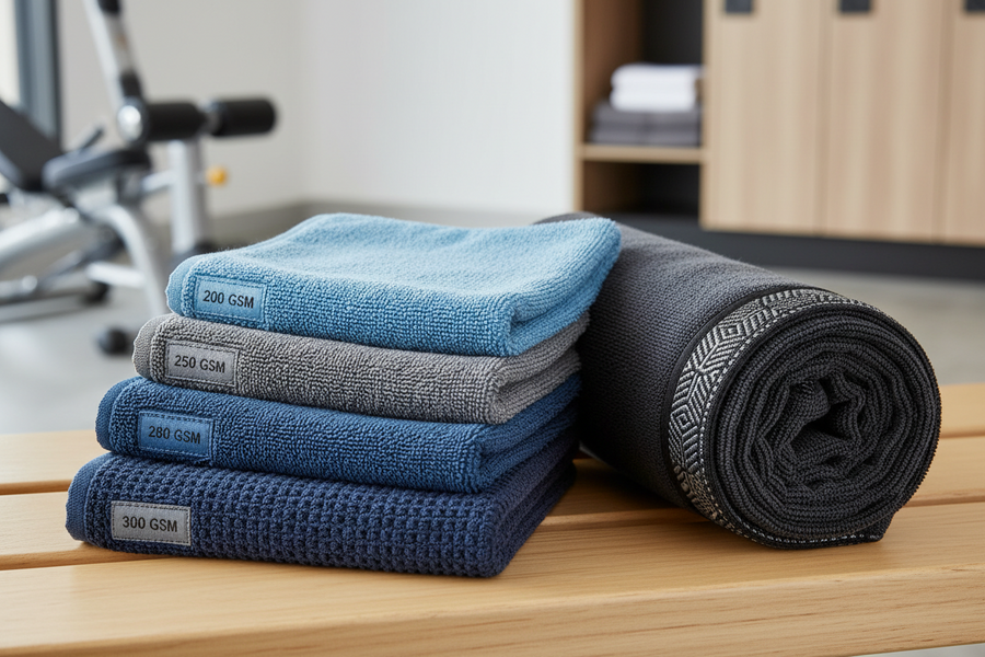
Here's what buyers rarely think about during the minimalist-branding conversation: the consistency of the blank itself. You can specify a perfect logo placement, a flawless color match, and a careful material choice. But if the blanks you receive vary from batch to batch in weight, texture, or shape, your minimalist mark will look different on every piece. A hoodie that is 200 GSM in one batch and 220 GSM in the next will print differently. A mug that shifts shape slightly between kiln loads will take the logo differently. These are not catastrophic problems—they are standard manufacturing tolerances. But they matter more when the brand mark is small and precise. A large, sprawling logo can hide minor variations. A clean, tight mark exposes them.
The honest answer here depends on things suppliers don't always tell you upfront. Some factories maintain tighter tolerances than others, and they charge for it. Some categories allow for more variation than others—woven textiles have natural give, while rigid products like ceramics and metal have less. A procurement manager who knows which categories are tight-tolerance and which are not can build a program that looks consistent without overpaying for precision that isn't needed. One supplier, two rounds of sampling, then you commit. That's the rhythm that works.
This is where a Multi-Category RFQ Bundling Strategy becomes useful. Rather than sending separate RFQs to separate vendors, you can bundle your apparel, drinkware, and stationery requirements into one document that sets shared standards—PMS values, maximum logo size, and minimum material specs—while still allowing per-category pricing. Vendors see your full program volume, not just one item, which often improves their pricing and attention.
5. How to Move Forward
If you're ready to move from a logo-heavy program to something more restrained, start with your standards. Define your brand's visual boundaries: one PMS color per product family, a maximum logo size for each category, and a required material grade (e.g., 100% combed ring-spun cotton for apparel, food-grade stainless steel for drinkware). Then find vendors who can meet those standards in their category of expertise.
Set up a Category Performance Review Cadence early—before you issue the PO. This is a structured check-in where you review each vendor's sample quality, lead time accuracy, and color consistency against your shared standards. It prevents surprises later and builds accountability into the process from the start. A Program-Wide KPI Dashboard Design can help you track these metrics across vendors without getting lost in per-supplier spreadsheets.
Finally, plan your timeline with the slowest category in mind. If your drinkware needs 25 days and your apparel needs 10, set your shipping window for the 25-day item and hold the others to that timeline. It saves logistics cost and reduces the mental overhead of managing multiple delivery windows. Minimalist branding is not just a design choice—it's a procurement discipline. The less you put on the product, the more you need to control what goes into it. That's a trade-off worth making.
6. Frequently Asked Questions
What is the difference between minimalist branding and simply putting a small logo on a product? Minimalist branding is intentional. It's not just small—it's thoughtfully placed, often using a single color or a single mark, and it considers the product's material and form. A small logo on a cheap item still looks cheap. Minimalism pairs restraint with quality across the whole product.
How do I prevent color drift when using multiple vendors across categories? Provide each vendor with a physical Pantone swatch and a reference sample showing your approved color on their specific substrate. Do not rely on digital proofs alone. During production, request a pre-production sample from each vendor and hold all samples against the same approved standard.
Which product categories are best suited for minimalist branding? Virtually all of them, but the execution varies. Apparel works well with embroidery or single-color screen printing. Drinkware and metal items suit laser engraving. Stationery benefits from debossing or foil stamping. The key is matching the decoration method to the material and the brand mark to the product's scale.
How do I evaluate a vendor's capability for minimalist branding? Ask to see samples of their previous work that used a single-color or small-placement logo. Look for sharp edges, consistent color, and clean registration. If they cannot show you high-quality examples of restrained branding, they may not be the right partner for your program.
Should I consider a single vendor for all categories or use specialists? There is no universal answer, but a specialist will typically deliver better quality in their core category than a generalist who offers everything. If your program spans three or four categories, consider consolidating with two specialist vendors rather than one broad supplier. Manage consistency through shared standards and a clear sample-approval process.