How to Build a Consistent Brand Look Across Custom Active Sets & Merch?
1. Translating Digital Design Systems to Physical Substrates
When corporate organizations roll out company-wide merchandise programs, maintaining visual harmony across different product categories is rarely as simple as handing a vector logo file to a supplier. A brand mark that looks balanced on a white digital dashboard or printed brochure behaves differently when transferred to physical items. Sourcing custom active sets—such as moisture-wicking athletic tops, poly-spandex joggers, and performance outerwear—requires understanding how synthetic textiles interact with inks, heat, and physical movement.
What actually determines whether a multi-product merchandise line looks unified is how accurately the design system accounts for substrate behavior. Performance activewear is engineered to stretch, breathe, and recover its shape under athletic tension. If a decorator applies standard rigid plastisol inks designed for heavy cotton t-shirts onto a four-way stretch activewear set, the graphic will crack, buckle, and distort as soon as the garment is worn. Maintaining clean visual consistency requires matching the decoration technique directly to the physical properties of the fabric.
Commercial decorating facilities utilize distinct methods to maintain graphic fidelity across diverse apparel substrates:
- Stretch Silicone Heat Transfers: Formulated with flexible elastomeric compounds that expand and contract alongside poly-spandex knits, ensuring logos retain crisp edges without cracking during active movement.
- Water-Based Ink Screen Printing: Penetrates the fibers of combed cotton t-shirts and fleece loungewear, leaving a breathable, soft hand-feel that matches the matte aesthetic of digital UI designs.
- High-Density Direct Embroidery: Delivers dimensional texture and durability on structured outerwear and performance jackets, provided backing stabilizers are calibrated to prevent fabric puckering.
Substrate-Calibrated Decoration
Substrate-Calibrated Decoration is the engineering practice of selecting specific ink formulations, transfer adhesives, and stitch densities tailored to the mechanical elasticity, heat tolerance, and surface porosity of a given base material, ensuring uniform logo geometry and color reproduction across different product types.
If flat cotton apparel and simple stationery are the only items in your merchandise program, standard screen printing and offset presses provide an economical solution; however, when your program expands to include technical custom active sets, specifying flexible silicone transfers or specialized dye processes is essential to preserve graphic integrity across every garment.
2. Sizing Runs, Fabric Blends & Bulk Color Consistency
Achieving a cohesive look across a complete merchandise collection requires strict color governance from the factory dye house to the final assembly line. What helps build a consistent brand look across physical goods is the rigorous documentation of exact color codes. Relying on generic visual naming conventions like "charcoal gray" or "royal blue" guarantees noticeable shade drift between your activewear sets, ceramic coffee mugs, and printed packaging boxes.
Color formulas must be specified across every standard color management system:
- Pantone Matching System (PMS): The universal standard for physical spot-color ink mixing on apparel, hard goods, and packaging. Specify PMS Solid Coated numbers for hard goods and PMS Textile Cotton eXtended (TCX) codes for fabrics.
- CMYK Color Breakdowns: The standard four-color process formula for offset and digital packaging, product tags, tissue paper, and marketing inserts.
- RGB & HEX Codes: The digital screen standards that establish the visual baseline across your main website, employee portals, and internal apps.
Benefits of Centralized Color Standards
- Guarantees repeatable color matching across multiple independent factories.
- Eliminates visible hue drift between synthetic knits and cotton goods.
- Establishes clear objective pass/fail metrics during quality control audits.
- Protects brand equity during high-volume corporate rollouts.
Risks of Uncalibrated Production
- Noticeable shade mismatch between tops and bottoms in active sets.
- Colors appear dull or shifted under office fluorescent lighting.
- Vendors guess ink formulas based on on-screen digital PDF proofs.
- High return rates and rejected batches during multi-department rollouts.
Different textile blends absorb dyes differently. A 100% combed cotton jersey takes up reactive dyes with high color depth, whereas an 88/12 polyester-spandex interlock knit requires disperse dyes under high pressure. Sourcing leads should require digital spectrophotometer color readings on pre-production lab dips, establishing an allowable Delta-E color variation limit under 1.0 to ensure garments from different production runs match seamlessly.
3. Applying the Rules of Brand Frequency
When enterprise organizations assemble merchandise programs, products serve distinct employee and client touchpoints. A single employee might receive an onboarding package containing a custom active set for wellness activities, an insulated travel tumbler for the morning commute, a debossed hardcover notebook for client meetings, and custom packaging boxes that tie the delivery together. If each item features a slightly different logo size, misaligned typography, or clashing colors, the collection feels uncoordinated.
Applying the classical 3-7-27 Rule of Branding highlights why merchandise consistency matters:
- 3 Seconds to Capture Attention: The initial sensory impression formed when a recipient opens an unboxing kit or encounters branded gear in a public space.
- 7 Interactions to Build Recognition: The recurring touchpoints—such as wearing an activewear hoodie to the gym, using a desk pen, or drinking from a branded tumbler—that cement brand awareness.
- 27 Exposures to Establish Deep Trust: The long-term, repeated integration of high-utility branded goods into daily life that transforms initial awareness into lasting organizational loyalty.
Building that level of trust requires strict adherence to the 5 C's of Branding: Clarity, Consistency, Continuity, Culture, and Connection. When physical merchandise mirrors the exact spacing, typography hierarchies, and aesthetic restraint of your primary website, every item functions as an authentic physical extension of your corporate culture.
Standardizing layout grids and iconography across products reinforces this connection. If your digital apps utilize minimalist line icons with a 2-pixel stroke weight and 4-pixel corner radii, the icons embroidered on your athletic apparel or printed on your tech accessories should reflect identical geometric rules.
4. Aligning Brand Real Estate Across Product Types
A central design system establishes explicit rules for logo placement, minimum reproduction sizes, and negative space boundaries across every physical product surface. Placing an oversized logo across the chest of an athletic shirt might suit a competitive sports team, but corporate wellness merchandise achieves higher adoption rates when branding is applied with understated restraint.
Decorating diverse product lines requires establishing clear placement protocols:
| Product Category | Approved Decoration Zone | Recommended Branding Scale | Technical Production Method |
|---|---|---|---|
| Custom Active Sets (Tops) | Left Chest / Upper Center Back | 2.0" – 3.0" Width Maximum | Matte Stretch Silicone Heat Transfer |
| Custom Active Sets (Bottoms) | Left Hip / Lower Calf Side Panel | 1.5" – 2.0" Width Maximum | Reflective or Tonal Silicone Print |
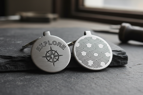
| Insulated Travel Drinkware | Lower Third Vertical / Centered Face | 1.5" – 2.5" Width Maximum | Precision Rotary Laser Engraving |
| Hardcover Office Journals | Lower Right Corner / Optical Center | 1.5" – 2.0" Width Maximum | Blind Cover Heat Debossing |
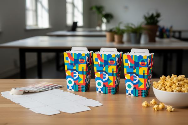
| Custom Packaging Boxes | Top Lid Exterior / Inside Flap | 4.0" – 8.0" Width Scaled | 1-Color Flexographic / Digital Print |
Restricting typography choices to two or three standard fonts is vital. Your primary header font, secondary body font, and approved numeric typeface should be the only typography permitted across product artwork. Documenting exact tracking, kerning, and minimum line thickness rules prevents decoration facilities from substituting standard system fonts when vector files are converted.
5. MOQ Tiers, Lead Times & Centralized Asset Management
Managing multi-category merchandise programs across several factory partners introduces logistical complexity. Sourcing custom active sets involves cut-and-sew manufacturing cycles of 30 to 45 days, whereas hard goods like laser-engraved drinkware or digital-printed packaging boxes operate on 15 to 25-day timelines. Without centralized asset control, production timelines diverge and vendors may utilize different, unapproved versions of your logo files.
Deploying a Centralized Digital Asset Management (DAM) Hub resolves these coordination challenges:
- Single Source of Truth: Store all master vector logos (EPS, AI, PDF), outlined typography files, and approved color swatch books in a secure, accessible repository.
- Locked Production Templates: Provide factories with pre-dimensioned tech packs that lock artwork coordinates, sizing ratios, and Pantone callouts.
- Version Control Governance: Immediately archive deprecated graphics and retired logos to prevent regional teams or vendors from placing reorders with legacy branding.
Understanding volume tier structures helps procurement managers consolidate orders across categories. Combining custom activewear orders with drinkware and stationery through unified production agreements allows buyers to meet factory minimum order quantities (MOQs) while securing volume discounts that lower total landed program costs.
6. Quality Control Protocols, Return Risk & Brand Audit Checklist
The final safeguard in building a consistent brand ecosystem is establishing systematic quality control and audit procedures. Even with comprehensive style guides, manufacturing variations occur. Inspecting inbound production lots against approved golden samples ensures that merchandise reaching employees and clients conforms to your organizational standards.
Field inspectors and internal brand stewards should audit shipments across five critical checkpoints:
Multi-Product Brand Consistency Audit Checklist
- Verify that all physical items utilize current master vector artwork from the centralized asset hub.
- Conduct spectrographic color audits to confirm fabric dyes and imprint inks match specified Pantone codes within Delta-E < 1.0.
- Perform stretch-recovery and wash-adhesion tests on activewear silicone heat transfers to verify no cracking occurs.
- Inspect logo dimensions and placement boundaries to ensure adherence to approved size and margin rules.
- Audit typography hierarchies across physical products and packaging to confirm no unauthorized font substitutions.
- Schedule quarterly brand reviews across all active vendor contracts to update style guides and retire legacy SKUs.
By investing in a centralized design system, enforcing exact color and typography standards, utilizing substrate-appropriate decoration techniques, and conducting disciplined brand audits, enterprise organizations transform everyday physical goods into a unified, professional brand ecosystem that drives long-term customer trust and employee engagement.