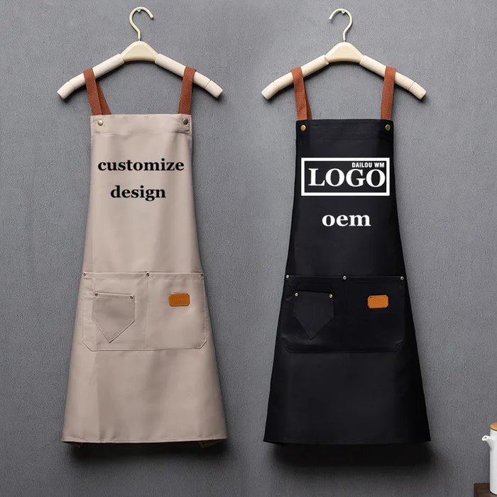
Why Simple Branding Often Works Better?
This is why simple branding often works better.
The Real Question: What Makes a Logo Look Premium?
The surface question is "how do we make our logo look good." The real question is "what factors actually determine whether a logo looks premium or cheap." The answer is not complexity. It is execution.
We've seen this pattern enough times to know it's not a one-off. A team ordering 200 custom t-shirts with a complex, multi-color design assumes the result will look professional. But the registration is off, the colors are muddy, and the fine details are lost. The result looks amateur. A simple, one-color logo printed with opaque ink and precise registration looks cleaner and more professional.
This is where most buyers slow down. The decision is not just about the design. It is about the production process. A simple logo that is printed well looks premium. A complex logo that is printed poorly looks cheap.
The real driver here is not the design itself—it's the alignment between the design and the print method. A simple design is easier to print accurately. A complex design has more points of failure.
The Case for Simple: Why Less Is Often More
Simple branding works better for several reasons: cost, execution, and durability.
Cost. A one-color screen print has the lowest setup cost. Each additional color adds a setup fee. A four-color logo costs significantly more to set up than a one-color logo. The per-unit cost is also higher because more ink passes are needed. For a tight budget, a simple design is the most cost-effective option.
Execution. A simple logo is easier to print accurately. Registration is simpler, and there are fewer colors to align. The result is a clean, crisp print. A complex design with multiple colors requires precise registration. If the registration is off, the print looks blurry or muddy. The risk of error is higher.
Durability. A simple screen print is durable. The ink bonds with the fabric and withstands washing. A complex design with multiple layers of ink may be more prone to cracking or fading. The simpler the design, the more durable the print.
It's worth noting how often the "premium" option and the "budget" option come from the very same factory floor. The difference is often the design complexity and the ink quality. A simple design with high-quality ink looks premium. A complex design with low-quality ink looks cheap.
- Simple design: Lower cost, easier to print, more durable, cleaner execution.
- High-quality substrate: A simple logo on 10oz canvas looks premium.
- Complex design: Higher cost, harder to print, more points of failure, potential for poor execution.
- Low-quality substrate: A simple logo on 80gsm non-woven PP looks budget.
Process Factors: How to Execute a Simple Print Well
A simple logo printed well looks premium. The key is in the execution, not the design.
Ink opacity. The ink must be opaque enough to cover the fabric color completely. On a dark fabric, a white underbase is often needed. Without an underbase, the ink will be translucent, and the fabric color will show through. The result looks cheap. A good supplier will use an opaque ink and adjust the mesh count to achieve solid coverage.
Mesh count. A medium mesh count (e.g., 156) is often a good balance for a simple logo. It deposits enough ink for solid coverage while maintaining detail. A coarser mesh (e.g., 110) deposits more ink, resulting in a thicker print. A finer mesh (e.g., 230) deposits less ink, resulting in a thinner print. The choice depends on the design and the substrate.
Registration. A simple logo still requires precise placement. A misregistered print will have blurry edges or be off-center. A good supplier will use registration marks and a stable printing jig to ensure accurate placement.
Substrate quality. A simple logo on a quality substrate looks premium. A 10oz canvas tote bag has a smooth surface that holds ink cleanly. A 80gsm non-woven PP tote has a textured, uneven surface that can cause ink to bleed. The substrate matters as much as the print.
Something that rarely gets discussed openly is how much day-to-day communication quality predicts whether a reorder goes smoothly. A supplier that is responsive and transparent during the quoting and sampling phase is more likely to deliver a quality print. Communication is a leading indicator of quality.
Simple Branding Checklist
- Choose a clean, simple logo design (1-2 colors).
- Select a quality substrate (10oz canvas, smooth cotton).
- Specify opaque ink and proper mesh count.
- Order a sample and inspect it for opacity and registration.
- Establish a golden sample for quality reference.
- Request a quality control report with each batch.
The Quality Consistency Framework
The decision framework should be anchored in how consistent the outcome is across repeat batches, not just the first sample. A single perfect sample is not a guarantee of quality. Consistency is the test.
When evaluating a supplier, consider these factors:
- Golden sample. Establish a physical reference—a golden sample—that production must match. The golden sample is the standard for color, registration, and opacity. Use it to approve the bulk order.
- Quality control process. Does the supplier have a formal QC process? What is their defect tolerance? Request a quality control report with the shipment. A documented QC process is a sign of a reliable supplier.
- Batch consistency. Order a small batch first. Assess the consistency across the batch. If the batch is consistent, the supplier is more likely to deliver consistent quality on larger orders.
- Communication. A supplier that is responsive and transparent during the quoting and sampling phase is more likely to be reliable during production. Communication is a leading indicator of quality.
Interestingly, most buyers who have done this before don't start with price — they start with communication speed and sample accuracy. A supplier that takes a week to respond to a simple question is likely to be slow throughout the process.
What Buyers Usually Ask Next
Why does simple branding often look more professional than complex branding? A simple, clean logo is easier to print accurately. Complex designs with gradients or multiple colors are harder to register, and the details can get lost on textured surfaces like canvas or non-woven PP. A simple design printed with opaque ink and precise registration looks crisp and professional. Complexity doesn't equal quality.
What is the most cost-effective way to brand a product? One-color screen printing is the most cost-effective method. The setup cost is per color, so a one-color print has the lowest setup fee. The per-unit cost is also lower because fewer ink passes are needed. A simple, one-color logo on a quality substrate looks professional without the extra cost.
How does the number of colors in a logo affect cost? Each color in a screen-printed design requires a separate screen and setup fee. A one-color logo costs less to set up than a four-color logo. The per-unit cost is also lower because fewer ink passes are needed. For DTF, color count does not affect setup cost, but it may affect per-unit cost slightly. More colors generally mean higher cost.
How do I ensure my simple logo looks premium? Use a high-quality substrate (like 10oz canvas), an opaque ink, and a precise registration. A simple logo printed poorly looks cheap. A simple logo printed well looks premium. The difference is in the execution, not the design. Order a sample and inspect it carefully.