What logo colors and decoration techniques deliver the highest visual contrast, brand compliance, and physical durability when applied to black apparel, drinkware, and tech accessories?
The Sample Box Realization: When Corporate Guidelines Meet Black Substrates
The sample box arrives a day before the deadline to approve it, and the color is almost—not quite—right. We have all experienced that exact moment of tension. You are managing uniform and merchandise orders for twelve regional franchise locations, and black was selected as the core product color because it is universal, stain-resistant, and visually sleek. The corporate brand package specifies a rich navy blue and dark forest green logo. On a white PDF proof, it looked perfectly balanced. But when you open the physical box containing the first production strike-off, the dark blue ink sits on the black fabric like a faint shadow, completely unreadable from across a counter.
What actually determines whether a logo works on a black product isn't the prestige of the brand color palette—it's the visual contrast ratio against a true black background (PMS Black C [DS: Pantone Matching System]). When corporate brand guidelines clash with physical store visibility, buying teams must navigate the gap between graphic design theory and manufacturing execution. The goal is to deliver merchandise that looks premium, meets corporate compliance, and stays legible across every location.
In our experience, the first sample rarely tells you everything—it’s the second round that reveals what the factory actually controls. Solving the dark-on-dark challenge requires selecting high-contrast color pairings, specifying proper underbase print mechanics, and knowing how different decoration methods behave when applied to dark materials.
High-Contrast Standards: Solid Whites, Metallic Accents, and High-Chroma Inks
When evaluating artwork contrast against black substrates, color choices fall into three distinct operational tiers: high-visibility primaries, reflective metallics, and subtle tonal shades. Knowing when to deploy each tier depends on whether the item is meant for high-visibility staff uniforms or low-profile executive gifts.
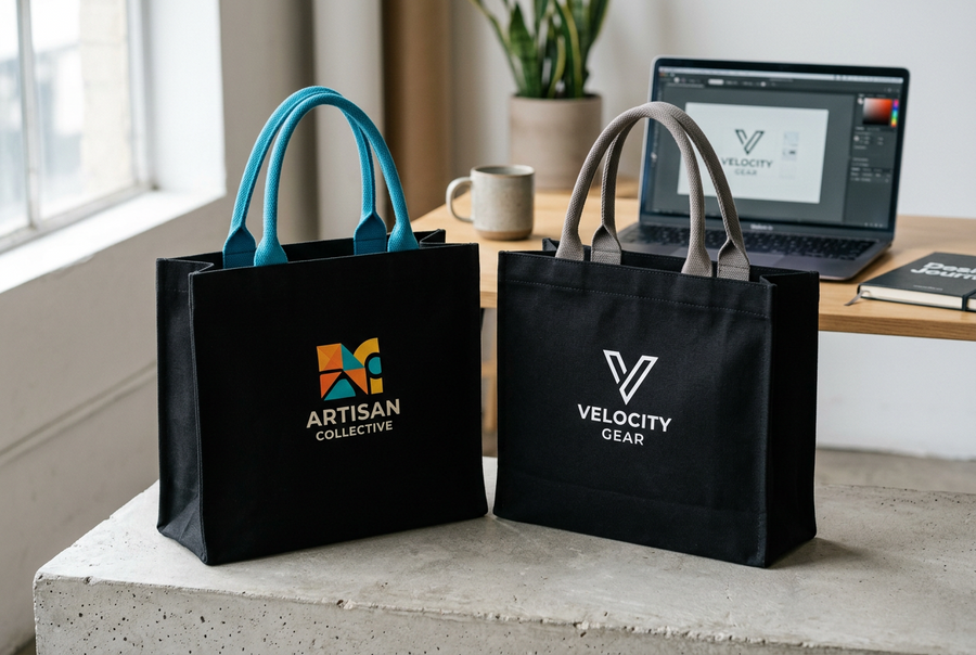
For high-frequency retail environments and staff uniforms where brand recognition from a distance is essential, nothing outperforms solid opaque white (Pantone Bright White). White provides the absolute maximum visual contrast against a black background, reflecting 100% of ambient room light. If your corporate logo contains dark secondary elements, converting those elements to crisp white or adding a thin 1.5-point white keyline outline around the perimeter instantly isolates the logo from the black substrate.
When pure white feels too utilitarian for retail merch or VIP gifts, high-chroma primary colors and metallic finishes provide an elevated alternative:
- High-Chroma Primaries: Optic yellow (PMS 102C), bright cyan (PMS 306C), and signal orange (PMS 021C) contain high pigment saturation that pops cleanly off black backgrounds.
- Metallic Inks & Foil Transfers: Metallic silver (PMS 877C) and metallic gold (PMS 871C) incorporate reflective metal flakes that catch overhead store lighting, creating a premium sheen while maintaining high contrast.
- Tonal / Monochromatic Shades: Mid-tone slate grey (PMS 423C) or dark charcoal (PMS 425C) can be used intentionally for "stealth" or tonal branding—such as executive jackets or retail streetwear drops—where a subtle, low-contrast mark is explicitly desired.
What’s easy to overlook is how much a single design revision late in the process can push back the whole timeline. Getting internal brand managers to pre-approve an official "Dark Background Logo Variant" (a reversed white or keylined artwork file) early in the procurement cycle prevents last-minute proofing holds when ordering black inventory.
The Technical Reality of Printing on Black: Why Underbases Make or Break Opacity
A common friction point in textile sourcing is approving a bright yellow or red logo proof, only to have the finished black t-shirts show up with a muddy, greenish-brown print. First-time buyers often assume the decorator mixed the ink incorrectly. In reality, the issue is dye migration and missing underbase mechanics.
Black cotton and synthetic fabrics are saturated with heavy dark dyes during the fabric milling process. Liquid plastisol or water-based screen printing inks are naturally semi-translucent. If a printer applies yellow, red, or light blue ink directly onto raw black fabric, the dark fabric dyes absorb into the wet ink layer during conveyor dryer curing [IR: 160°C / 320°F plastisol curing threshold]. The black dye bleeds through, dulling the topcoat color completely.
To achieve vibrant, color-accurate prints on dark textiles, decorators must execute a two-step flash-and-print process:
- The White Blocker Underbase Pass: The printer first screen-prints a dense 100% white low-bleed barrier underbase layer directly onto the black garment.
- The Intermediate Flash Cure: The white underbase pass is quickly heat-flashed to skin the top layer of ink, sealing the underlying fabric dyes beneath a solid white thermal shield.
- The Topcoat Pantone Inks: Your primary brand colors are printed directly over the cured white underbase layer, allowing the topcoat pigments to render with 100% color accuracy and complete opacity.
It’s common for two suppliers to describe the "same" material using completely different testing methods. When reviewing apparel factory quotes for dark garments, verify that the decorator's line item includes a dedicated underbase screen and flash-cure pass. Skipping the underbase saves a few cents per unit on tooling, but ruins the visual quality of the finished garment.
Laser Engraving and Hard Goods: What Color Does Black Actually Etch?
When sourcing black drinkware, anodized aluminum tech tools, or custom USB flash drives, decoration mechanics shift from liquid ink to thermal surface removal. A frequent question from brand managers is, "Can we laser engrave our logo in red or blue on a black tumbler?"
Laser marking hardware does not apply pigment. A fiber laser beam focuses intense thermal energy onto the product surface, instantly vaporizing the exterior black powder-coat or anodized paint layer [DS]. The resulting logo color is dictated entirely by the underlying metal substrate beneath the finish.
On stainless steel tumblers, powder-coated water bottles, and anodized aluminum power banks, laser engraving strips the black coating to reveal the raw metal underneath—producing a crisp, permanent, matte silver or off-white contrast. Because raw metal naturally reflects light, silver laser marking on black hard goods offers outstanding legibility, zero risk of flaking, and 100% dishwasher durability [IR].
If your brand guidelines strictly require a multi-color or PMS-matched logo on black hard goods, you must switch decoration processes from laser engraving to spot pad-printing, screen-printing, or UV digital printing. However, keep in mind that topical printed inks on smooth metal surfaces require pre-treatment flame or chemical priming to resist chipping during daily handling.
Embroidery Threads on Black Textiles: Managing Sheen and Small Details
For high-wear store uniforms, fleece outerwear, and structured headwear, direct embroidery is the industry standard for durability. Selecting thread colors for black caps or polo shirts introduces different visual considerations than screen printing, primarily due to thread sheen and stitch density.
Standard 40-weight polyester embroidery thread [DS: ASTM D204 thread construction standard] has a natural glossy sheen that reflects room light. High-visibility thread shades—such as Bright White, Sterling Silver, Metallic Gold, and Canary Yellow—pop off black fabric with crisp, three-dimensional depth. Metallic silver and gold threads are particularly effective on black headwear and outerwear, delivering an executive look while remaining fully legible under fluorescent store lighting.
However, dark embroidery colors present specific legibility risks on black fabric:
- Thin Text and Fine Lines: Any text smaller than 0.25 inches in height [IR] embroidered in a medium or dark shade (like royal blue or crimson) will sink into the black fabric weave, blurring letter clarity.
- Dark Fill Areas: Large solid fills in dark navy or hunter green thread create a flat, heavy texture that blends into black cotton twill or fleece from more than two feet away.
- Density and Underlay: Ensure your digitizer programs a dense tatami underlay stitch pattern beneath light-colored threads on black fleece to keep individual black fabric fibers from poking through the embroidered logo.
Interestingly, most buyers who have done this before don’t start with price—they start with communication speed and sample accuracy. Working with a decorator who understands embroidery digitizing underlays ensures your logos stay sharp across hundreds of staff polo shirts.
The Judgment Call: Adapting Corporate Guidelines for Storefront Success
Managing multi-location merchandise orders comes down to making a pragmatic judgment call when corporate brand standards meet physical storefront reality. Forcing an un-outlined dark navy logo onto 500 black staff aprons or ceramic custom coffee mugs because "navy is our official primary color" results in invisible branding and wasted procurement capital.
The solution is establishing a clear, standardized adaptation rule for all dark product orders:
- Primary Rule: Use Official Knockout Artwork: Convert all dark brand elements to pure white or metallic silver on dark background products. Most corporate brand books already contain an approved "Dark Substrate / Reversed" logo file for this exact purpose.
- Secondary Rule: Add a High-Contrast Keyline: If brand managers insist on retaining primary dark colors (like navy or crimson), add a thin 1.5-pt to 2-pt white, silver, or gold keyline stroke around the perimeter of the artwork to separate it from the black material.
- Enforce Physical Pre-Production Proofing: Require every location vendor to supply a physical or high-resolution macro photo proof under 5000K daylight inspection lighting before authorizing full production runs.
Taking a disciplined, contrast-first approach to logo decoration ensures your brand looks authoritative, professional, and instantly recognizable across every store location.
What Buyers Usually Ask Next
What is the difference between plastisol ink and discharge printing on black cotton shirts?
Plastisol ink sits on top of the fabric fibers, requiring a white underbase pass for full opacity on black cotton. Discharge screen printing uses a chemical bleaching agent mixed with pigment that removes the dark dye from 100% cotton fibers and replaces it with your logo color, resulting in an extremely soft, weightless hand-feel that never cracks or peels.
Can we use direct-to-garment (DTG) printing for colorful logos on black hoodies?
Yes, modern Direct-to-Garment (DTG) digital printers handle multi-color logos on black garments effectively. The DTG printer automatically sprays a specialized liquid pre-treatment and a white digital underbase layer before applying CMYK process inks, allowing complex gradients and detailed photos to render clearly on dark fleece.
How do we keep white screen-printed logos from cracking on black stretch fabrics?
When printing white logos on stretchable black garments (such as performance polyester or spandex blends), require your decorator to mix a stretch additive flex agent into the plastisol ink formulation and use a low-cure blocker underbase. This allows the cured ink layer to expand with the fabric without cracking during wear.
What is the best way to clean and care for black garments with white screen prints?
To preserve bright white ink opacity and prevent black lint transfer, wash decorated black garments inside out in cold water with mild detergent, avoiding chlorine bleach. Tumble dry on low heat or line dry to prevent thermal degradation of the cured ink layer over repeated laundering cycles [DS: ISO 105-C06 wash fastness standard].
Practical Summary for Procurement Leads
Achieving crisp, high-visibility branding on black products requires pairing high-contrast colors with disciplined decoration specs. Protecting your brand image across multiple store locations comes down to mastering contrast and proofing execution.
To guarantee excellent results on every black product order, stick to these three core principles:
1. Prioritize High-Contrast Color Selection: Deploy pure white, metallic silver/gold, or high-chroma primary pigments (yellow, cyan, orange) to ensure maximum legibility from a distance.
2. Mandate White Blocker Underbases on Textiles: Always verify that screen printers include a flash-cured 100% white low-bleed underbase pass when printing light inks onto dark cotton or synthetic fabrics to prevent dye migration.
3. Utilize Reversed Artwork or Outlines for Dark Logos: Convert dark corporate logo elements to reversed white files or apply a high-contrast keyline border to separate dark brand marks from black product backgrounds.